The Mashup Feature allows user to select from the wide variety of chart options available. Lets take a quick look for each chart type in this section :
Area/Line/Bar/Column Chart
The First chart type allows users to create visualization of parameters variables vs time series. Once created the chart can be interswitched to 3 other visualization. For example if a line chart is created between Time vs Frequency , it can be changed to Bar chart, Column chart and Area Chart with the help of Three vertical dot button on top right corner of the chart.
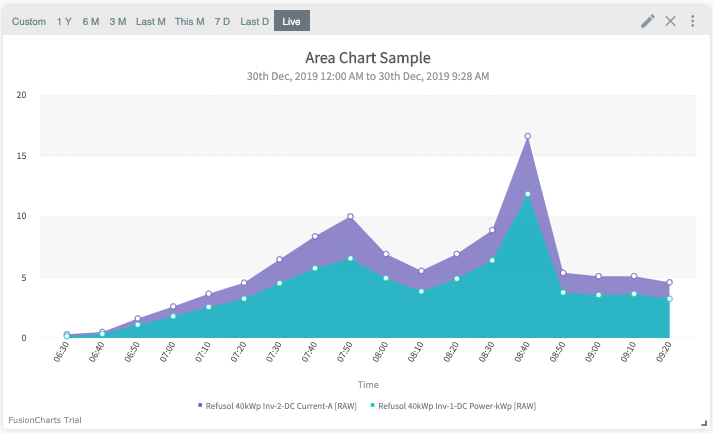
Area Chart
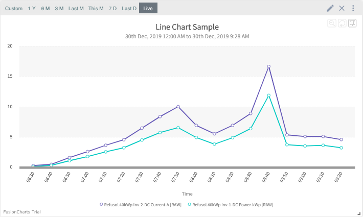
Line Chart
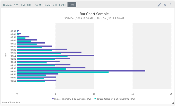
Bar Chart
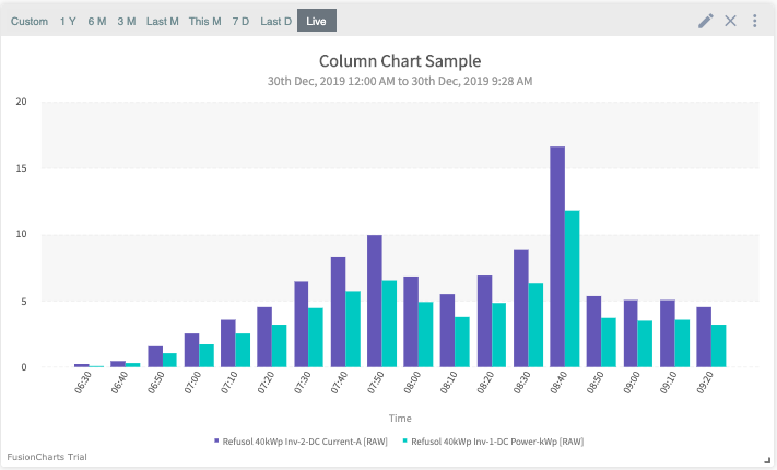
Column Chart
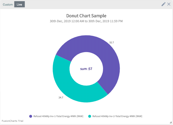
Donut Chart
This chart is used to describe the proportionate relation of the parameters. For example, to guage the contribution of daily energy of all the inverters at a site, this chart is made.
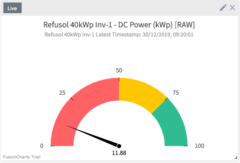
Guage Chart
Gauge charts use needles to show information as a reading on a dial. On a gauge chart, the value for each needle is read against the colored data range or chart axis.
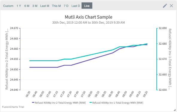
Multi Axis Line Chart
A multi-axis line chart, as the name suggests, is an interactive line chart that can be configured for multiple axes. The chart is used when the scale of two parameters differ, for example if the Daily energy of 10 kw inverter and 500 kw inverter is to be visualised , this chart is used.
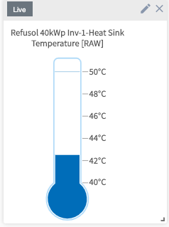
Temperature Chart
This chart is used to visualize differnet temperatures associated with solar plant in an interactive, thermostat view
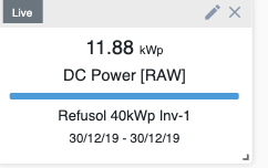
Value Widget Chart
This chart shows the value of the selected paramter in the widget form.
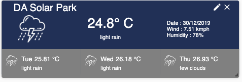
Weather Chart
This chart uses the location of the solar plant and shows the current and forecasted weather related pertaiing to that site.
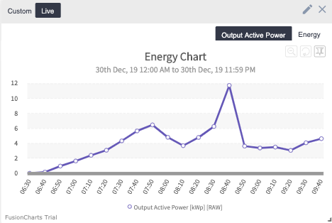
Energy Power Chart
This chart is the same replica of Energy and Output Power as present on the ‘Generation Analyis’ main screen.