It is one of the most powerful and extensively popular feature among the Trackso users. Data can be best interpreted when visualized, Trackso allows its users to build custom visualizations and gain maximum insights out of their data.
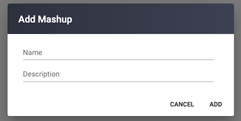
We start by adding mashup with its name and description. By adding the mashup the user can get a full canvas to add multiple charts in a single view.
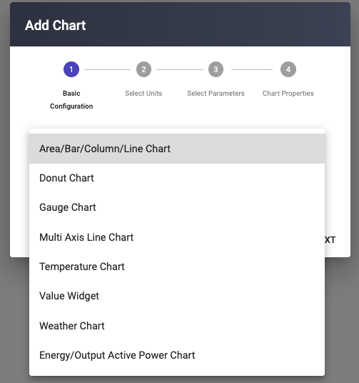
User select the chart type for the appropriate visualization.
- Chart Type : (pictures included)
- Area/ Bar/Column/Line chart
- Gauge Chart
- Donut Chart
- Multi Axis Ine chart
- Tempearure Chart
- Value Widget
- Weather Widget
- Energy/Output Active Power
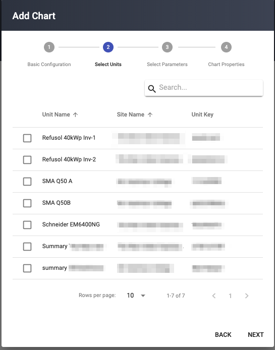
User selects the the Device/Devices by slecting the checkbox for which the visualization is required.
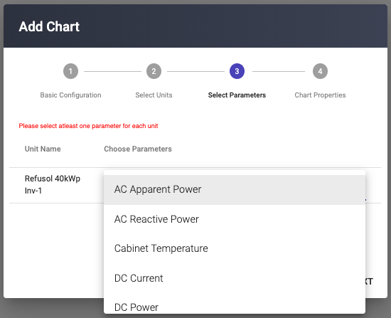
All the parameters associated with that unit are available for selection, User can select the parameters for which the visualizations are to be made.
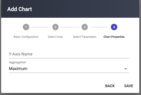
The Aggegation provides the method by which the the data is aggregated across time.
- Average
- Count
- Last
- Min
- Max
- Sum
- Your chart gets created in the front canvas of the Mashup plane.
- Once chart gets created the , user can select from the availabale filters to move across the timeline of the visualization, which varies from different options such as Live, Last Day, Data for last 7 days, data for this month, last 3 months 6 months and an year.
- The chart is provided with the option to edit chart properties, parameter selection and aggregation selection.